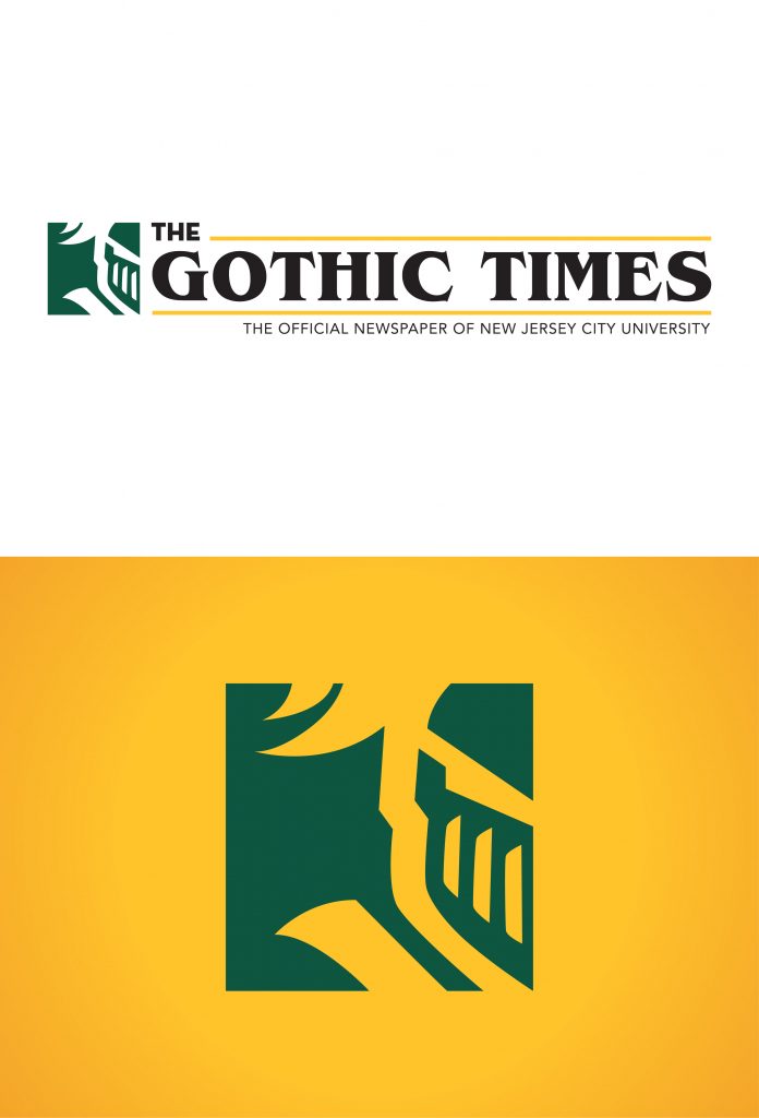
THE GOTHIC TIMES
Deliverable: Branding
Tools: Adobe Illustrator
As soon as I began my duties at The Gothic Times, I volunteered to work on their branding. I proposed that we upgrade the branding to a cleaner & more modern look. The design I proposed struck a balance between illustrating the traditional history of the paper & looked cleaner than its predecessor. I achieved the above balance by introducing contrast through the serif & sans-serif typefaces, & contained the insignia within a square. To ensure that the logo is legible in all sizes, I removed all the details from the previous iteration of Gothic Knight, NJCU’s official mascot, & reduced it to a stamped-out silhouette. The design was approved by the team & has since been immortalized as their official branding.
